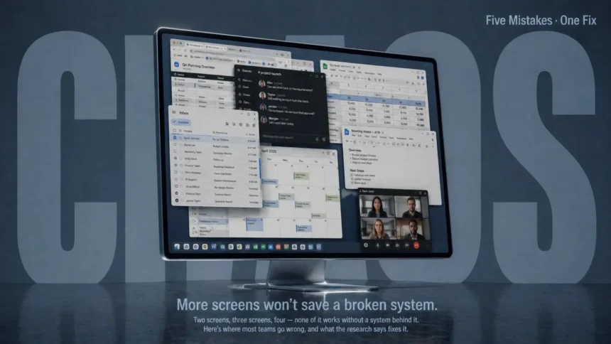
Multiple screens are supposed to make work easier. Microsoft’s own research found that switching to multi-monitor configurations can boost productivity between 9% and 50%. Jon Peddie Research reported users estimating an average 42% productivity gain. A University of Utah study — one of the most cited in this space — found that 98% of participants preferred dual monitors over single screens, with measurable improvements in task speed, error recovery, and comfort.
So why do so many teams end up with a multi-screen setup that creates more problems than it solves?
Because the screens themselves were never the issue. How teams manage them is where things fall apart. Whether it’s a dual-monitor workstation on every desk or a network of digital displays across an office, the same five mistakes show up consistently — and they’re all backed by research that explains exactly why they happen.
What’s the Biggest Mistake Teams Make With Multi-Screen Setups?
Treating each screen as an independent project instead of part of a connected system.
That’s the short answer. But it unpacks into five specific problems that feed into each other. Miss one, and it quietly drags down everything the extra screen real estate was supposed to fix.
The five at a glance:
- Mistake 1: No clear purpose assigned to each screen — so people default to scattering apps randomly.
- Mistake 2: Ignoring the ergonomic setup — creating neck strain, eye fatigue, and reduced focus.
- Mistake 3: Using extra screens as a licence to multitask harder — which research says destroys focus rather than helping it.
- Mistake 4: No centralised management for shared or public displays — so content drifts out of sync silently.
- Mistake 5: Skipping monitoring and maintenance — so problems go unnoticed until a screen goes dark or shows stale information.
Mistake 1: Screens Without Assigned Roles Become Clutter Zones
Here’s a question worth asking anyone with two or three monitors: can you describe what each screen is for?
Most people can’t. They’ll say something vague like “I put my email on the second one” — but when you watch how they actually work, it’s a mess. Slack on the left, then a browser tab drifts over there, then a spreadsheet replaces it, then Slack moves to the right screen for no clear reason. The layout shifts throughout the day based on whatever happened to land where.
The Steelcase-IDEO research on multi-monitor work processes identified two distinct usage patterns: active applications (constant data sharing between screens — comparing, cutting, pasting, building new information) and passive reference (one screen holds static reference material while the primary screen does the active work). Both patterns have legitimate uses. But mixing them randomly — which is what most people do — eliminates the cognitive benefit that extra screens provide.
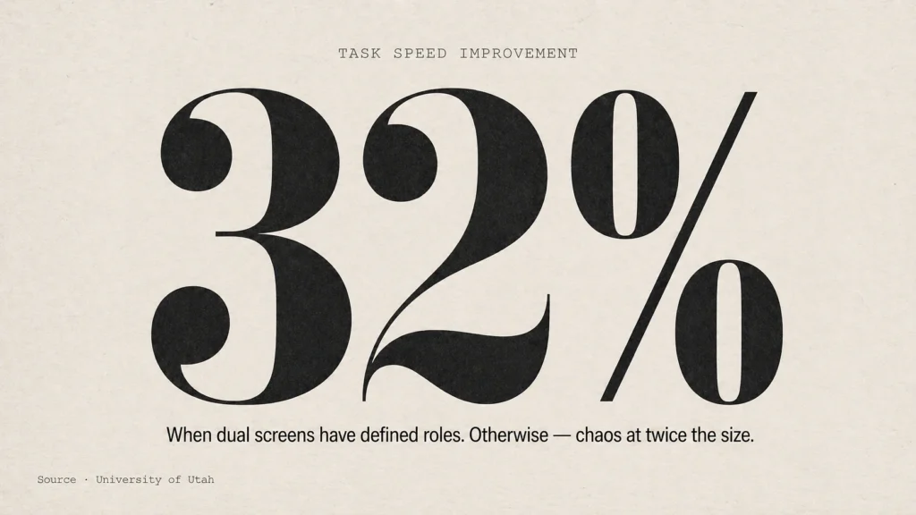
The University of Utah study found that multi-screen setups delivered a 32% improvement in task speed and made tasks 29% more effective — but only when the screens were used with defined roles. The productivity gain comes from having relevant information visible simultaneously without switching windows. If screens don’t have assigned purposes, you’re just spreading the same chaos across more real estate.
What the research says works:
- Primary/secondary model: Main screen directly ahead for active work. Secondary screen angled 15° to the side for reference material — email, chat, documentation. Steelcase recommends this when a user spends the majority of time on single-screen tasks.
- Equal-split model: Both screens at a slight V-angle, inner edges nearly touching, centred on the user’s eyeline. Works when users genuinely split time 50/50 between two active applications. Common for traders, designers, and video editors.
- The rule that matters: Pick a model and stick to it for at least a full work week. The productivity benefit requires your brain to build a spatial map of where information lives. Reshuffling daily kills that.
Mistake 2: The Ergonomics Get Ignored and Nobody Connects the Neck Pain to the Screens

This one is sneaky because the damage doesn’t show up immediately. It builds over weeks.
A 2025 narrative review published in the International Journal of Industrial Ergonomics (de Paula et al., Lin et al., Nakatsuka et al.) surveyed 208 computer users and reviewed published studies on multi-monitor setups. Their finding: dual monitors improve task performance but increase neck and visual strain. The ergonomic impact depends heavily on monitor layout, task type, and screen size — and current ergonomic guidelines haven’t kept pace with how people actually use multiple screens in 2026.
The problem is straightforward. When screens aren’t positioned correctly, users hold their neck in a rotated or extended position for hours. Alabdulmohsen’s 2011 research demonstrated that working with two side-by-side screens leads to more frequent neck rotation and sustained muscle strain in the neck and shoulder region. That strain compounds daily.
And it’s not just the neck. The University of Irvine and Wiholm et al. found that eye discomfort and neck/shoulder pain coexist in 21% of multi-monitor users — the visual strain from constantly refocusing across different distances and angles triggers musculoskeletal symptoms in the neck and shoulders simultaneously. A survey of telecom workers confirmed that ocular symptoms and wearing spectacles were associated with higher frequency of neck and shoulder problems.
What the research says works:
- Height match: All monitors at the same height, top edge at or slightly below eye level. Ergonomists specifically discourage stacking monitors because the neck extension required to look up causes pain over time.
- Distance: Arm’s length (60-70cm) from your eyes. If the desk is too shallow, a monitor arm pushes screens back to the correct distance.
- Angle: 15-30° inward angle for side monitors. The goal — from BakkerElkhuizen’s whitepaper on multi-screen ergonomics — is to glance at secondary screens by moving your eyes, not turning your entire head.
- Matching displays: Same size, same resolution, same brightness calibration. Mismatched screens force your eyes to constantly readjust between different pixel densities and colour temperatures. That adjustment is invisible but fatiguing.
Herman Miller’s own ergonomic guidance notes a 70% increase in dual monitor use since 2002 — but flags that the productivity payoff gets eaten by back pain and eye strain when the physical setup is wrong.
Mistake 3: More Screens Becomes an Excuse to Multitask More — Which Backfires Badly
This is the most counterintuitive one. Surely more screen space means you can do more things at once? Isn’t that the entire point?
No. And this is where the research gets uncomfortable.
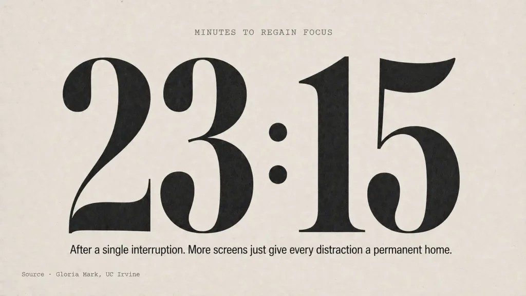
Professor Gloria Mark at the University of California, Irvine conducted what’s become the landmark study on context switching. Her finding: after a single interruption, it takes an average of 23 minutes and 15 seconds to fully regain deep focus. Not seconds. Not a couple of minutes. Twenty-three minutes.
A joint study by Qatalog and Cornell University found that toggling between different digital apps costs an average of 9.5 minutes to get back into productive workflow — even for brief switches. In the same survey, 45% of workers said switching between too many apps makes them less productive, and 43% reported it as mentally exhausting.
Harvard Business Review estimates that knowledge workers toggle between applications over 1,200 times per day, costing roughly four hours of productive time per week just on reorientation — which adds up to approximately five lost working weeks per year.
Here’s the multi-screen connection: when you have two or three monitors, the temptation to keep more applications visible simultaneously increases. Email stays open on one screen. Slack stays open on another. A browser with twelve tabs lives on the third. Every notification is visible. Every message is instantly readable. The screens aren’t helping you focus — they’re giving every distraction a permanent, always-visible home.
The Iowa Department of Transportation documented this in practice. Their Traffic Incident Managers were using fifteen different software applications across three monitors. The result? Redundant data entry, unnecessary task switching, and delayed responses. When researchers consolidated those fifteen applications into a single structured interface, it produced a 42.9% reduction in the steps required to manage an incident.
More screens didn’t help. Fewer, better-organised screens did.
What the research says works:
- Intentional visibility: Only the application you’re actively working in should be on your primary screen. Reference material on the secondary. Everything else closed or minimised — not “visible but ignored,” because your brain doesn’t actually ignore things in your visual field.
- Notification quarantine: If you must keep communication tools open, put them on the furthest screen from your primary work and disable all visual notification badges. The UC Irvine research found that even the anticipation of an interruption degrades focus, not just the interruption itself.
- Time-blocked screen layouts: Some teams set different screen configurations for different blocks of work — “deep work” layout (primary app only, everything else hidden) versus “communication” layout (email, chat, calendar visible). Switching layouts signals to the brain that the work mode has changed.
Mistake 4: Shared and Public Displays Run Without Centralised Management

This shifts from individual workstations to the other side of multi-screen management — the displays that teams share. Conference room screens, lobby displays, dashboard monitors, retail signage, menu boards, information kiosks. The moment an organisation has more than three or four of these, the management problem begins.
The Digital Screen Media Association reported in 2024 that following structured setup protocols reduces post-installation service calls by 63%. Which implies the inverse: most installations skip those protocols and pay for it in ongoing support calls.
The PiSignage team published a 2026 analysis of why screen updates fail structurally. Their breakdown identifies a pattern that anyone managing multiple displays will recognise immediately:
- Content originates in one place — a document, spreadsheet, or design file maintained by marketing or operations.
- Update decisions happen elsewhere — approval chains, scheduled reviews, or ad-hoc requests from stakeholders who don’t control the source file.
- Execution happens in a third place entirely — IT pushes files, a content manager uploads assets, or an automated sync runs on a schedule nobody remembers setting.
- Responsibility for correctness exists nowhere explicitly.
That last point is the killer. When content on a shared display is wrong or outdated, there’s typically no clear owner. Marketing assumes IT pushed the update. IT assumes marketing uploaded the new file. The screen shows last month’s pricing for two weeks before someone walking past actually notices.
AVIXA’s 2024 technical reports found that improper app linking accounts for 38% of early-stage content display failures in cloud signage setups. Not hardware problems. Not network outages. Configuration mistakes that happen because no single person owns the process end to end.
What the research says works:
- Single platform for creation, approval, and deployment. The USB-drive-per-screen model that smaller businesses default to is the root of most sync problems. Cloud-based centralised management — one person updates content, it propagates to all screens — eliminates the three-system disconnect.
- Explicit permissions and audit trails. Who changed what, when. Not as a bureaucratic exercise, but because when something goes wrong (and it will), you need to trace backwards from the error to the source in minutes, not hours.
- Offline resilience. Network outages shouldn’t blank the screen. Content should persist locally so that connectivity failures don’t cascade into display failures.
Mistake 5: No Monitoring Means Problems Go Invisible Until Someone Walks Past a Dark Screen
This applies to both individual workstations and shared displays, but it’s particularly damaging for organisations running networks of screens across locations.
The truDigital team’s 2025 analysis of digital signage warning signs identified a pattern: most display failures don’t happen suddenly. They develop gradually through subtle indicators — flickering, colour shifts, content that stops updating on schedule despite working network connections, syncing delays between displays that create inconsistent messaging.
For individual workstations, the monitoring gap is different but equally real. The ScienceDirect narrative review from 2025 emphasised that the ergonomic impact of multi-monitor use is “still not well understood” precisely because organisations don’t track it. Monitor heights drift as people adjust them. Colour calibrations shift over time. One screen develops a slight flicker that the user learns to ignore but that contributes to eye fatigue measurably.
The Crown TV team documented a retail franchise that wired up 30+ screens only to discover they couldn’t sync them properly after installation. A restaurant chain spent $75,000 on outdoor displays that couldn’t handle glare. These aren’t technology failures. They’re monitoring failures — nobody checked whether the setup actually worked under real conditions before committing.
What the research says works:
- Automated health checks. For shared displays, modern signage platforms ping each screen every 60-90 seconds. If a device goes unresponsive, the team knows before a customer does.
- Scheduled ergonomic reviews for workstations. Not a one-time setup. A quarterly check — are monitors still at the right height? Has anything been repositioned? Are cables creating trip hazards that force awkward desk arrangements?
- Proactive maintenance cycles. Firmware updates, cable replacement before failure, brightness and colour recalibration. The truDigital analysis found that screens showing signs of component degradation (dead pixel clusters, colour wash) almost always worsen if left unaddressed.
The Common Thread Across All Five
Every mistake on this list traces back to the same root cause: treating screens as hardware purchases rather than workflow infrastructure. You buy them, plug them in, and assume the productivity benefit happens automatically.
It doesn’t. The University of Utah study, the Microsoft research, the Jon Peddie data, the Wichita State analysis — all of them measured productivity gains under configured, purposeful setups. Not random arrangements. Not “put your email somewhere.” Configured systems where each screen had a role, the ergonomics were set correctly, and the workflow was designed to reduce context switching rather than enable more of it.
The 18% increase in errorless production that the University of Utah measured? That came from multi-screen configurations where the setup was intentional. The 33% fewer errors that dual-screen users achieved compared to single-screen users? Same condition — defined roles, proper positioning, deliberate workflow design.
Multi-screen setups work. The research is clear on that. But they work as systems — connected, managed, maintained, and reviewed. The moment screens become independent islands — each one managed separately, positioned however was convenient, loaded with whatever happened to be open — the productivity gain disappears into neck pain, context switching overhead, and sync failures that nobody notices until they’ve already cost hours.
Sources referenced in this article:
- University of Utah / NEC Display Solutions / ATI Technologies — “Productivity and Multi-Screen Displays” study, 2003.
- Microsoft Research — multi-monitor productivity study (9-50% productivity gain finding).
- Jon Peddie Research — multi-monitor user survey (42% average productivity estimate).
- Wichita State University Software Usability Research Laboratory — monitor productivity study, 2011 (commissioned by Dell).
- Steelcase / IDEO — primary research on monitor use and work processes.
- Gloria Mark, University of California, Irvine — “The Cost of Interrupted Work” (23 min 15 sec refocus finding).
- Qatalog / Cornell University — joint study on app toggling (9.5 min refocus, 45% productivity loss reported).
- ScienceDirect / International Journal of Industrial Ergonomics — “Workstation Ergonomics in the Era of Multi-Monitor Technology: A Narrative Review and Survey,” 2025.
- Alabdulmohsen, 2011 — neck rotation and muscle strain in dual-screen work.
- Wiholm et al., 2007 — coexistence of eye discomfort and neck/shoulder pain (21% finding).
- BakkerElkhuizen — “Optimal Performance with Two or More Computer Screens” whitepaper.
- Herman Miller — “Seeing Double: The Effects of Multiple Monitor Arms” ergonomic guidance.
- Iowa Department of Transportation — Traffic Incident Manager multi-screen consolidation study (42.9% step reduction).
- Digital Screen Media Association, 2024 — structured setup protocol impact (63% fewer service calls).
- PiSignage, 2026 — “Why Screen Updates Fail” structural analysis.
- AVIXA Technical Reports, 2024 — app linking failure rate in cloud signage (38% finding).
- truDigital, 2025 — digital signage failure warning signs analysis.
- Crown TV — digital signage installation failure case studies.