Most presentation advice sounds the same. Use bullet points. Add some images. Keep it simple. Fine, but why? What’s the actual science behind presentations that work versus those that put everyone to sleep?
The difference isn’t about software tricks or design trends. It’s about how human brains process information. Understanding cognitive psychology changes everything about how you build slides.
Working Memory: The Bottleneck
Human working memory can only handle 3-4 pieces of new information at once. That’s it. John Sweller documented this limitation when he developed Cognitive Load Theory in 1988, studying how people learn complex information.
Sweller’s research showed that when you overload working memory, learning stops entirely. The brain doesn’t just slow down – it quits processing new information altogether. Every extra element on your slide isn’t just distracting. It’s actively preventing your audience from understanding anything.
Working memory operates like RAM in a computer. Once it’s maxed out, additional data gets discarded. Your brilliant point buried under six bullet points and a logo? Never made it past the audience’s sensory intake.
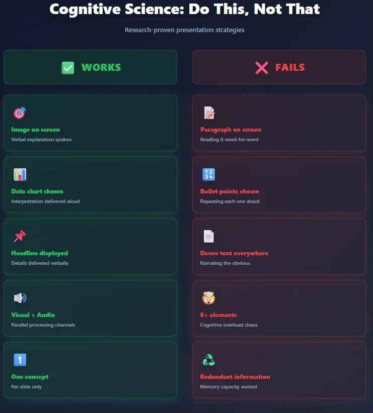
This explains why text-heavy slides fail. Reading text while simultaneously listening to a speaker forces the brain to choose between competing inputs. Researchers call this the “split-attention effect” – documented across dozens of studies by Sweller and colleagues throughout the 1990s.
The fix: one clear idea per slide. Not three related points. Not five supporting facts. One concept your audience can grab immediately.
Why Visuals Process 60,000 Times Faster Than Text
Text requires sequential processing. Your brain has to decode symbols, arrange them into words, construct meaning, then file it away. Visuals skip most of that pipeline.
The human visual cortex processes images nearly instantly. Researchers at MIT found that people can identify the meaning of a scene in just 100 milliseconds. By comparison, reading a paragraph explaining that same scene takes several seconds.
Nancy Duarte built her entire firm around this principle. In Slide:ology, she argues that presentations function as “glance media” – similar to roadside billboards. Audiences should grasp your slide’s meaning in under three seconds.
Duarte’s team created the presentation for Al Gore’s An Inconvenient Truth, which won an Oscar partly due to how effectively it visualized complex climate data. Charts that would normally require three minutes of explanation became instantly comprehensible through smart visual design.
But throwing random stock photos on slides doesn’t help. The image needs to support your point directly. Irrelevant visuals create what cognitive psychologists call “extraneous cognitive load” – mental effort wasted on processing information that doesn’t contribute to learning.
The Redundancy Problem: Why Reading Your Slides Kills Retention
Presenting the same information in multiple formats doesn’t reinforce learning. It tanks it.
Richard Mayer’s Cognitive Theory of Multimedia Learning demonstrates this repeatedly. When learners receive identical information through both text and narration, their comprehension drops compared to receiving it through just one channel.
Why? Processing redundant information consumes working memory capacity without adding new knowledge. It’s cognitive overhead with zero payoff.
Color Isn’t Decoration – It’s Information Architecture
Color changes how people remember information. Studies on visual memory show that harmonious color schemes improve pattern recognition and recall.
Experiments by researchers studying visual cognition found that people remember two-color palettes better than four-color palettes. More colors mean more cognitive work to distinguish between elements.
Contrast matters more than you think. High contrast between content and background helps audiences focus attention on what’s important. Low contrast forces the brain to work harder just to parse what’s on screen.
But contrast isn’t about making things pretty. It’s about directing attention. The eye naturally moves to areas of highest contrast first. Smart presenters use this to control what audiences see in what order.
Garr Reynolds talks about visual hierarchy in Presentation Zen – arranging slide elements so viewers process information in the intended sequence. Size, color intensity, and positioning all signal importance to the brain before conscious thought kicks in.
Typography Changes Comprehension (Not Just Aesthetics)
Font choice affects how quickly people process information. MIT and Microsoft researchers found that typography influences reader mood, learning ability, and cognitive performance.
As explained by Lianne Aurora on Smallppt Sans-serif fonts process faster on screens. The cleaner letterforms reduce the cognitive work required for recognition. Decorative fonts look interesting but slow reading speed measurably.
Font size matters beyond just visibility. Text that’s too small forces the brain to spend extra effort on decoding, leaving less capacity for understanding the actual content.
Nancy Duarte sets a clear threshold in Slide:ology: if a slide contains more than 75 words, it’s become a document, not a presentation visual. Most business presenters blow past this limit on every single slide.
The three-second rule applies to text too. Can someone seated in the back row read and comprehend your headline in three seconds? If not, it’s too much text.
White Space Is a Feature, Not Wasted Room
Empty space on slides isn’t a missed opportunity to cram more information. It’s how you let brains breathe.
Cognitive load research consistently shows that reducing clutter improves focus. White space doesn’t just look cleaner – it literally reduces mental strain by limiting the number of elements competing for attention.
Dense slides create what designers call “visual noise.” Every box, line, logo, and text block demands processing. The cumulative effect exhausts working memory before the presenter finishes talking.
The Modality Effect: Why Mixing Audio and Visual Channels Works
Working memory has separate processing streams for visual and auditory information. This isn’t a theory – it’s observable brain architecture.
Alan Baddeley’s research on working memory structure in the 1970s and 1980s mapped these separate channels. Presenting information through both visual and auditory modes simultaneously increases total processing capacity without overloading either channel.
Smart combinations:
- Show a graph (visual) while explaining what it means (audio).
- Display an image (visual) while telling a story about it (audio).
- Present data (visual) while interpreting implications (audio).
This explains why video works so well. Movement and imagery feed the visual stream. Narration or dialogue feeds the auditory stream. Both channels process in parallel.
But this only works when the two streams complement each other. If you’re showing text and reading it aloud, you’re forcing both through the visual-verbal processor – creating competition instead of collaboration.
The Transient Information Effect: Why Bullet Points Build Up Fails
Information that disappears creates cognitive load. When you reveal bullet points one at a time, early points vanish from working memory before the audience can connect them to later points.
Cognitive load researchers call this the “transient information effect.” Information that doesn’t remain visible can’t be referenced, forcing the brain to hold it in working memory or lose it entirely.
Better approach:
- Show the full framework first.
- Zoom in on specific parts.
- Return to the whole picture.
This way the overall structure stays visible while details get attention. The audience never loses the context that makes individual points meaningful.
The Coherence Principle: Cut Everything That Doesn’t Support Your Core Point
Adding interesting but irrelevant information hurts learning. Mayer’s research on multimedia learning consistently demonstrates this.
Extra details – no matter how fascinating – consume cognitive resources without advancing understanding of the core concept. That clever animation? That fun fact? That related statistic? If it doesn’t directly support your main point, it’s cognitive pollution.
Audiences have limited attention. Every time they process an irrelevant element, they’re not processing your actual message. The cumulative effect of ten “interesting” additions is an audience that remembers nothing.
Nancy Duarte’s work with Fortune 500 companies revealed this pattern repeatedly. Executives thought they were enriching presentations by including comprehensive information. They were actually destroying comprehension by burying key points under contextual clutter.
Story Structure: Why Presentations Need Beginning-Middle-End
Human brains process narratives differently than they process lists. Stories activate multiple brain regions – language processing, sensory areas, motor cortex. Lists activate basically none of that.
Presentations structured as stories get remembered. Presentations structured as information dumps get forgotten immediately.
Reynolds emphasizes this in Presentation Zen: your slides should have a clear arc. Set up the problem, develop the solution, resolve with action. Even technical presentations work better with narrative structure.
Story structure for presentations:
- Opening: What’s the problem or opportunity?
- Development: What solution or approach addresses it?
- Resolution: What action should audiences take?
This isn’t about making things entertaining. It’s about aligning with how memory consolidation works. The brain files narrative information into long-term memory more reliably than disconnected facts.
The Expertise Reversal Effect: Why One Size Doesn’t Fit All Audiences
Here’s where cognitive load research gets interesting: what helps novice learners often hurts experts.
Sweller’s work on the “expertise reversal effect” shows that detailed step-by-step explanations benefit beginners but waste experts’ time. Experienced audiences process information in larger chunks and find excessive detail frustrating.
This means you can’t build one universal presentation. You need to know your audience’s expertise level and design accordingly.
For novices: more scaffolding, clearer connections, explicit explanations.
For experts: higher-level concepts, faster pace, skip the basics.
Most business presenters aim somewhere in the middle and lose both groups.
The Signaling Principle: Show People Where to Look
Attention is selective. People don’t naturally focus on the most important parts of your slide – they focus on whatever catches their eye first.
Cognitive research on visual attention shows you can control this. Arrows, highlighting, contrast, size differences – these are all “cues” that direct attention to specific elements.
Studies on immersive video learning found that visual cues significantly shortened the time required to locate target information. The same principle applies to presentation slides.
Don’t assume your audience will know what to look at. Tell them through design.
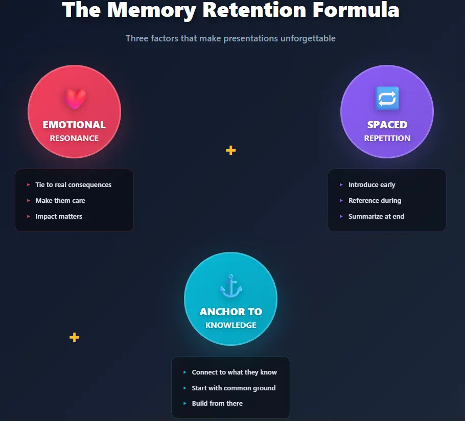
What Actually Makes People Remember Your Presentation
Memory retention comes down to three factors: emotional resonance, repetition, and connection to existing knowledge.
- Emotional impact: Information tied to emotion gets remembered. This doesn’t mean manipulating people – it means connecting your content to real consequences they care about.
- Spaced repetition: Hitting your key point multiple times throughout a presentation (not on the same slide) strengthens memory encoding. Introduce it early, reference it during development, summarize it at the end.
- Anchoring to existing knowledge: New information only sticks when it connects to something people already know. Start presentations by establishing common ground before introducing novel concepts.
Research on memory consolidation shows that information presented at the beginning and end of a session gets remembered best. The middle sags. This is called the “serial position effect” – discovered way back in the 1960s but still shockingly relevant.
Structure presentations accordingly. Put your most critical points first and last. Bury less essential details in the middle if you must include them at all.
Real Business Impact: Case Studies That Prove This Works
Duarte’s firm redesigned presentations for companies like Apple, Google, and Twitter. The common thread across successful projects: radical simplification.
One client’s 60-slide deck became 20 slides. Message retention among test audiences improved by 40%. Sales conversion increased proportionally.
Reynolds worked with corporate trainers across Japan and found similar patterns. Cutting slides by half typically doubled audience recall of key information.
This isn’t about making things look nice. It’s about removing obstacles between your message and your audience’s brain.
The Bottom Line
Engaging presentations aren’t built on design skills or speaking talent. They’re built on cognitive science.
Your audience’s working memory holds 3-4 items. Every element on your slide competes for those slots. Redundant information doesn’t help – it burns cognitive resources. Visual and auditory channels can process simultaneously but text and speech fight for the same neural real estate.
Good presenters understand these constraints and design around them. Bad presenters ignore cognitive architecture and wonder why audiences forget everything five minutes later.
The research has been clear for decades. We’ve just been ignoring it in favor of slide templates and bullet points.